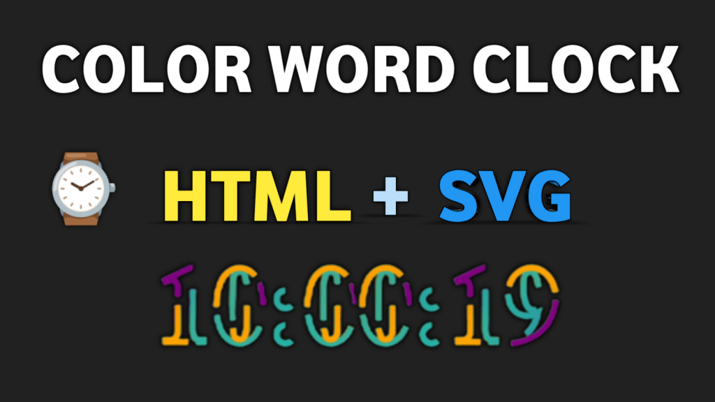
HTML+SVG Color Word Clock: A Creative Timepiece
In the digital age, timekeeping has evolved beyond traditional clocks with hands and digits. One fascinating innovation in the world of time display is the HTML+SVG color word clock. This innovative timepiece not only tells time but does so in a visually stunning and creative way. In this article, we’ll explore the concept of the HTML+SVG color word clock, its working principle, its artistic appeal, and its practical applications.
-
Responsive Movie Landing Page Website Design
-
Anime Website Design Using HTML CSS JavaScript
-
Online Cake Shop Website Design With Source Code
-
Hotel Booking Website Design HTML CSS and JAVASCRIPT
Understanding HTML and SVG
Before delving into the intricacies of the HTML+SVG color word clock, let’s first understand the core components: HTML and SVG.
HTML (Hypertext Markup Language)
HTML is the backbone of web content. It is a markup language used to create the structure and layout of web pages. In the context of the word clock, HTML plays a pivotal role in organizing and presenting the clock’s visual elements.
SVG (Scalable Vector Graphics)
SVG is a vector graphics format used for creating two-dimensional images. Unlike bitmap images, SVG images can be scaled without loss of quality. In our HTML+SVG word clock, SVG is used to define the words and shapes that form the clock’s display.
How the HTML+SVG Color Word Clock Works
Displaying Time with Words
The HTML+SVG color word clock conveys the time by illuminating specific words to represent hours, minutes, and occasionally, seconds. This unique approach replaces the traditional clock face and hands with a grid of words.
Word Grid Structure
The word grid is typically organized into rows and columns. Each row corresponds to a specific unit of time (e.g., hours, minutes), while each column contains words representing different increments within that unit. For example, the word “five” might appear in the “minutes” row, while “o’clock” appears in the “hours” row.
Dynamic Updating
As time passes, the HTML+SVG color word clock dynamically updates the display. Words representing the current time are highlighted or colored, creating a visually appealing and functional timekeeping experience.
Index.html
					<!DOCTYPE html>
<html lang="en">
<head>
    <meta charset="UTF-8">
    <meta name="viewport" content="width=device-width, initial-scale=1.0">
    <title>HTML+SVG color Word clock </title>
    <link rel="stylesheet" href="style.css">
</head>
<body>
    <svg>
        <text id="time" text-anchor="middle" x="50%"
        y="50%"></text>
        <text id="time" text-anchor="middle" x="50%"
        y="50%"></text>
        <text id="time" text-anchor="middle" x="50%"
        y="50%"></text>
        <text id="time" text-anchor="middle" x="50%"
        y="50%"></text>
    </svg> <script data-no-optimize="1">!function(t,e){"object"==typeof exports&&"undefined"!=typeof module?module.exports=e():"function"==typeof define&&define.amd?define(e):(t="undefined"!=typeof globalThis?globalThis:t||self).LazyLoad=e()}(this,function(){"use strict";function e(){return(e=Object.assign||function(t){for(var e=1;e<arguments.length;e++){var n,a=arguments[e];for(n in a)Object.prototype.hasOwnProperty.call(a,n)&&(t[n]=a[n])}return t}).apply(this,arguments)}function i(t){return e({},it,t)}function o(t,e){var n,a="LazyLoad::Initialized",i=new t(e);try{n=new CustomEvent(a,{detail:{instance:i}})}catch(t){(n=document.createEvent("CustomEvent")).initCustomEvent(a,!1,!1,{instance:i})}window.dispatchEvent(n)}function l(t,e){return t.getAttribute(gt+e)}function c(t){return l(t,bt)}function s(t,e){return function(t,e,n){e=gt+e;null!==n?t.setAttribute(e,n):t.removeAttribute(e)}(t,bt,e)}function r(t){return s(t,null),0}function u(t){return null===c(t)}function d(t){return c(t)===vt}function f(t,e,n,a){t&&(void 0===a?void 0===n?t(e):t(e,n):t(e,n,a))}function _(t,e){nt?t.classList.add(e):t.className+=(t.className?" ":"")+e}function v(t,e){nt?t.classList.remove(e):t.className=t.className.replace(new RegExp("(^|\\s+)"+e+"(\\s+|$)")," ").replace(/^\s+/,"").replace(/\s+$/,"")}function g(t){return t.llTempImage}function b(t,e){!e||(e=e._observer)&&e.unobserve(t)}function p(t,e){t&&(t.loadingCount+=e)}function h(t,e){t&&(t.toLoadCount=e)}function n(t){for(var e,n=[],a=0;e=t.children[a];a+=1)"SOURCE"===e.tagName&&n.push(e);return n}function m(t,e){(t=t.parentNode)&&"PICTURE"===t.tagName&&n(t).forEach(e)}function a(t,e){n(t).forEach(e)}function E(t){return!!t[st]}function I(t){return t[st]}function y(t){return delete t[st]}function A(e,t){var n;E(e)||(n={},t.forEach(function(t){n[t]=e.getAttribute(t)}),e[st]=n)}function k(a,t){var i;E(a)&&(i=I(a),t.forEach(function(t){var e,n;e=a,(t=i[n=t])?e.setAttribute(n,t):e.removeAttribute(n)}))}function L(t,e,n){_(t,e.class_loading),s(t,ut),n&&(p(n,1),f(e.callback_loading,t,n))}function w(t,e,n){n&&t.setAttribute(e,n)}function x(t,e){w(t,ct,l(t,e.data_sizes)),w(t,rt,l(t,e.data_srcset)),w(t,ot,l(t,e.data_src))}function O(t,e,n){var a=l(t,e.data_bg_multi),i=l(t,e.data_bg_multi_hidpi);(a=at&&i?i:a)&&(t.style.backgroundImage=a,n=n,_(t=t,(e=e).class_applied),s(t,ft),n&&(e.unobserve_completed&&b(t,e),f(e.callback_applied,t,n)))}function N(t,e){!e||0<e.loadingCount||0<e.toLoadCount||f(t.callback_finish,e)}function C(t,e,n){t.addEventListener(e,n),t.llEvLisnrs[e]=n}function M(t){return!!t.llEvLisnrs}function z(t){if(M(t)){var e,n,a=t.llEvLisnrs;for(e in a){var i=a[e];n=e,i=i,t.removeEventListener(n,i)}delete t.llEvLisnrs}}function R(t,e,n){var a;delete t.llTempImage,p(n,-1),(a=n)&&--a.toLoadCount,v(t,e.class_loading),e.unobserve_completed&&b(t,n)}function T(o,r,c){var l=g(o)||o;M(l)||function(t,e,n){M(t)||(t.llEvLisnrs={});var a="VIDEO"===t.tagName?"loadeddata":"load";C(t,a,e),C(t,"error",n)}(l,function(t){var e,n,a,i;n=r,a=c,i=d(e=o),R(e,n,a),_(e,n.class_loaded),s(e,dt),f(n.callback_loaded,e,a),i||N(n,a),z(l)},function(t){var e,n,a,i;n=r,a=c,i=d(e=o),R(e,n,a),_(e,n.class_error),s(e,_t),f(n.callback_error,e,a),i||N(n,a),z(l)})}function G(t,e,n){var a,i,o,r,c;t.llTempImage=document.createElement("IMG"),T(t,e,n),E(c=t)||(c[st]={backgroundImage:c.style.backgroundImage}),o=n,r=l(a=t,(i=e).data_bg),c=l(a,i.data_bg_hidpi),(r=at&&c?c:r)&&(a.style.backgroundImage='url("'.concat(r,'")'),g(a).setAttribute(ot,r),L(a,i,o)),O(t,e,n)}function D(t,e,n){var a;T(t,e,n),a=e,e=n,(t=It[(n=t).tagName])&&(t(n,a),L(n,a,e))}function V(t,e,n){var a;a=t,(-1<yt.indexOf(a.tagName)?D:G)(t,e,n)}function F(t,e,n){var a;t.setAttribute("loading","lazy"),T(t,e,n),a=e,(e=It[(n=t).tagName])&&e(n,a),s(t,vt)}function j(t){t.removeAttribute(ot),t.removeAttribute(rt),t.removeAttribute(ct)}function P(t){m(t,function(t){k(t,Et)}),k(t,Et)}function S(t){var e;(e=At[t.tagName])?e(t):E(e=t)&&(t=I(e),e.style.backgroundImage=t.backgroundImage)}function U(t,e){var n;S(t),n=e,u(e=t)||d(e)||(v(e,n.class_entered),v(e,n.class_exited),v(e,n.class_applied),v(e,n.class_loading),v(e,n.class_loaded),v(e,n.class_error)),r(t),y(t)}function $(t,e,n,a){var i;n.cancel_on_exit&&(c(t)!==ut||"IMG"===t.tagName&&(z(t),m(i=t,function(t){j(t)}),j(i),P(t),v(t,n.class_loading),p(a,-1),r(t),f(n.callback_cancel,t,e,a)))}function q(t,e,n,a){var i,o,r=(o=t,0<=pt.indexOf(c(o)));s(t,"entered"),_(t,n.class_entered),v(t,n.class_exited),i=t,o=a,n.unobserve_entered&&b(i,o),f(n.callback_enter,t,e,a),r||V(t,n,a)}function H(t){return t.use_native&&"loading"in HTMLImageElement.prototype}function B(t,i,o){t.forEach(function(t){return(a=t).isIntersecting||0<a.intersectionRatio?q(t.target,t,i,o):(e=t.target,n=t,a=i,t=o,void(u(e)||(_(e,a.class_exited),$(e,n,a,t),f(a.callback_exit,e,n,t))));var e,n,a})}function J(e,n){var t;et&&!H(e)&&(n._observer=new IntersectionObserver(function(t){B(t,e,n)},{root:(t=e).container===document?null:t.container,rootMargin:t.thresholds||t.threshold+"px"}))}function K(t){return Array.prototype.slice.call(t)}function Q(t){return t.container.querySelectorAll(t.elements_selector)}function W(t){return c(t)===_t}function X(t,e){return e=t||Q(e),K(e).filter(u)}function Y(e,t){var n;(n=Q(e),K(n).filter(W)).forEach(function(t){v(t,e.class_error),r(t)}),t.update()}function t(t,e){var n,a,t=i(t);this._settings=t,this.loadingCount=0,J(t,this),n=t,a=this,Z&&window.addEventListener("online",function(){Y(n,a)}),this.update(e)}var Z="undefined"!=typeof window,tt=Z&&!("onscroll"in window)||"undefined"!=typeof navigator&&/(gle|ing|ro)bot|crawl|spider/i.test(navigator.userAgent),et=Z&&"IntersectionObserver"in window,nt=Z&&"classList"in document.createElement("p"),at=Z&&1<window.devicePixelRatio,it={elements_selector:".lazy",container:tt||Z?document:null,threshold:300,thresholds:null,data_src:"src",data_srcset:"srcset",data_sizes:"sizes",data_bg:"bg",data_bg_hidpi:"bg-hidpi",data_bg_multi:"bg-multi",data_bg_multi_hidpi:"bg-multi-hidpi",data_poster:"poster",class_applied:"applied",class_loading:"litespeed-loading",class_loaded:"litespeed-loaded",class_error:"error",class_entered:"entered",class_exited:"exited",unobserve_completed:!0,unobserve_entered:!1,cancel_on_exit:!0,callback_enter:null,callback_exit:null,callback_applied:null,callback_loading:null,callback_loaded:null,callback_error:null,callback_finish:null,callback_cancel:null,use_native:!1},ot="src",rt="srcset",ct="sizes",lt="poster",st="llOriginalAttrs",ut="loading",dt="loaded",ft="applied",_t="error",vt="native",gt="data-",bt="ll-status",pt=[ut,dt,ft,_t],ht=[ot],mt=[ot,lt],Et=[ot,rt,ct],It={IMG:function(t,e){m(t,function(t){A(t,Et),x(t,e)}),A(t,Et),x(t,e)},IFRAME:function(t,e){A(t,ht),w(t,ot,l(t,e.data_src))},VIDEO:function(t,e){a(t,function(t){A(t,ht),w(t,ot,l(t,e.data_src))}),A(t,mt),w(t,lt,l(t,e.data_poster)),w(t,ot,l(t,e.data_src)),t.load()}},yt=["IMG","IFRAME","VIDEO"],At={IMG:P,IFRAME:function(t){k(t,ht)},VIDEO:function(t){a(t,function(t){k(t,ht)}),k(t,mt),t.load()}},kt=["IMG","IFRAME","VIDEO"];return t.prototype={update:function(t){var e,n,a,i=this._settings,o=X(t,i);{if(h(this,o.length),!tt&&et)return H(i)?(e=i,n=this,o.forEach(function(t){-1!==kt.indexOf(t.tagName)&&F(t,e,n)}),void h(n,0)):(t=this._observer,i=o,t.disconnect(),a=t,void i.forEach(function(t){a.observe(t)}));this.loadAll(o)}},destroy:function(){this._observer&&this._observer.disconnect(),Q(this._settings).forEach(function(t){y(t)}),delete this._observer,delete this._settings,delete this.loadingCount,delete this.toLoadCount},loadAll:function(t){var e=this,n=this._settings;X(t,n).forEach(function(t){b(t,e),V(t,n,e)})},restoreAll:function(){var e=this._settings;Q(e).forEach(function(t){U(t,e)})}},t.load=function(t,e){e=i(e);V(t,e)},t.resetStatus=function(t){r(t)},Z&&function(t,e){if(e)if(e.length)for(var n,a=0;n=e[a];a+=1)o(t,n);else o(t,e)}(t,window.lazyLoadOptions),t});!function(e,t){"use strict";function a(){t.body.classList.add("litespeed_lazyloaded")}function n(){console.log("[LiteSpeed] Start Lazy Load Images"),d=new LazyLoad({elements_selector:"[data-lazyloaded]",callback_finish:a}),o=function(){d.update()},e.MutationObserver&&new MutationObserver(o).observe(t.documentElement,{childList:!0,subtree:!0,attributes:!0})}var d,o;e.addEventListener?e.addEventListener("load",n,!1):e.attachEvent("onload",n)}(window,document);</script><script data-no-optimize="1">var litespeed_vary=document.cookie.replace(/(?:(?:^|.*;\s*)_lscache_vary\s*\=\s*([^;]*).*$)|^.*$/,"");litespeed_vary||fetch("/wp-content/plugins/litespeed-cache/guest.vary.php",{method:"POST",cache:"no-cache",redirect:"follow"}).then(e=>e.json()).then(e=>{console.log(e),e.hasOwnProperty("reload")&&"yes"==e.reload&&(sessionStorage.setItem("litespeed_docref",document.referrer),window.location.reload(!0))});</script><script data-optimized="1" type="litespeed/javascript" data-src="https://dailywebdesigns.com/wp-content/litespeed/js/244880a5cd603cb893a0eb3de05dc9c7.js?ver=59974"></script><script>const litespeed_ui_events=["mouseover","click","keydown","wheel","touchmove","touchstart"];var urlCreator=window.URL||window.webkitURL;function litespeed_load_delayed_js_force(){console.log("[LiteSpeed] Start Load JS Delayed"),litespeed_ui_events.forEach(e=>{window.removeEventListener(e,litespeed_load_delayed_js_force,{passive:!0})}),document.querySelectorAll("iframe[data-litespeed-src]").forEach(e=>{e.setAttribute("src",e.getAttribute("data-litespeed-src"))}),"loading"==document.readyState?window.addEventListener("DOMContentLoaded",litespeed_load_delayed_js):litespeed_load_delayed_js()}litespeed_ui_events.forEach(e=>{window.addEventListener(e,litespeed_load_delayed_js_force,{passive:!0})});async function litespeed_load_delayed_js(){let t=[];for(var d in document.querySelectorAll('script[type="litespeed/javascript"]').forEach(e=>{t.push(e)}),t)await new Promise(e=>litespeed_load_one(t[d],e));document.dispatchEvent(new Event("DOMContentLiteSpeedLoaded")),window.dispatchEvent(new Event("DOMContentLiteSpeedLoaded"))}function litespeed_load_one(t,e){console.log("[LiteSpeed] Load ",t);var d=document.createElement("script");d.addEventListener("load",e),d.addEventListener("error",e),t.getAttributeNames().forEach(e=>{"type"!=e&&d.setAttribute("data-src"==e?"src":e,t.getAttribute(e))});let a=!(d.type="text/javascript");!d.src&&t.textContent&&(d.src=litespeed_inline2src(t.textContent),a=!0),t.after(d),t.remove(),a&&e()}function litespeed_inline2src(t){try{var d=urlCreator.createObjectURL(new Blob([t.replace(/^(?:<!--)?(.*?)(?:-->)?$/gm,"$1")],{type:"text/javascript"}))}catch(e){d="data:text/javascript;base64,"+btoa(t.replace(/^(?:<!--)?(.*?)(?:-->)?$/gm,"$1"))}return d}</script></body>
</html>
style.css
					*{
    margin: 0;
    padding: 0;
}
html{
    height: 100%;
}
body{
    background: black;
    height: 100%;
}
svg{
    height: 100%;
    width: 100%;
}
.words{
    font-size: 22vh;
    font-weight: bold;
    text-transform: uppercase;
    fill: none;
    stroke-width: 8px;
    stroke-dasharray: 90,310;
    animation-name: drawing;
    animation-duration: 8s;
    animation-iteration-count: infinite;
    animation-timing-function: linear;
}
.words-1{
    stroke: deepskyblue;
    text-shadow: 0 0 50px deepskyblue;
    animation-delay: 2s;
}
.words-2{
    stroke: lightseagreen;
    text-shadow: 0 0 50px lightseagreen;
    animation-delay: -4s;
}
.words-3{
    stroke: orange;
    text-shadow: 0 0 50px orange;
    animation-delay: -6s;
}
.words-4{
    stroke: purple;
    text-shadow: 0 0 50px purple;
    animation-delay: -8s;
}
@keyframes drawing{
    100%{
        stroke-dashoffset: -400;
    }
}
main.js
					function showtime(){
    var noatime = new Date();
    var h = noatime.getHours();
        m = noatime.getMinutes();
        s = noatime.getSeconds();
h=checktime(h);
m=checktime(m);
s=checktime(s);
return h+":"+m+":"+s;
}
function checktime(x) {
    if (x<10){
        x="0"+x;
    }
    return x;
}
var div1=document.getElementsByTagName("text");
setInterval(function() {
    for (var i in div1){
        div1[i].innerHTML=showtime();
    }
}, 1000);
Conclusion
In a world where conventional timekeeping devices dominate, the HTML+SVG color word clock stands out as a blend of technology and artistry. Its unique approach to displaying time, coupled with its aesthetic customization options, make it a captivating addition to any space. Whether you seek a practical timekeeping solution or a conversation piece, the word clock offers both in abundance.
FAQs (Frequently Asked Questions)
Can I customize the words on the HTML+SVG color word clock? Yes, many word clocks allow you to customize the words and phrases displayed, giving you full creative control.
Is the HTML+SVG color word clock energy-efficient? Yes, most word clocks use energy-efficient LED technology, making them environmentally friendly.
Can I use the word clock in a dimly lit room? Absolutely! The word clock is designed to be visible in various lighting conditions, including dimly lit rooms.
Are there mobile apps that replicate the HTML+SVG word clock experience? Yes, there are mobile apps available that simulate the word clock on your smartphone or tablet.
Where can I purchase an HTML+SVG color word clock? You can find a variety of options online through e-commerce platforms and specialty stores.